What Clients Are Really Looking For When They Browse a Portfolio
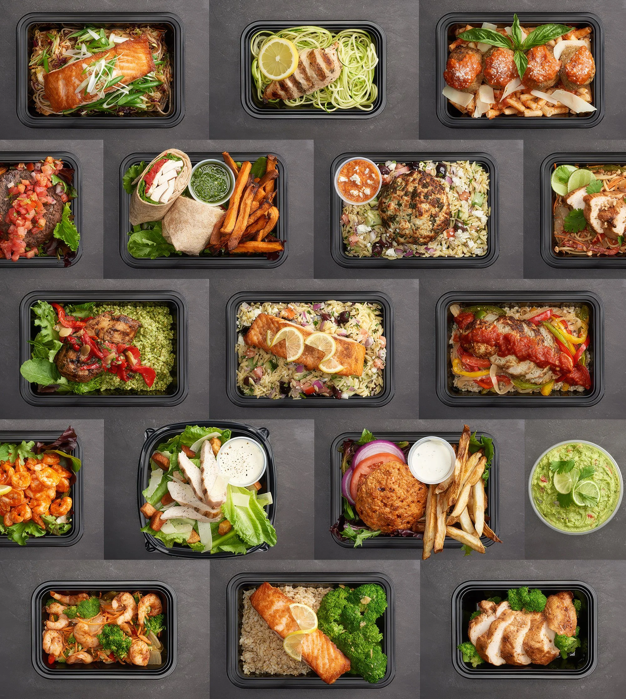
I've been thinking a lot about consistency lately — from the micro to the macro. What kicked it off was working on a redesign of this website, unearthing a LOT of older images that no longer live on public-facing pages but still hang out on the back end, like these shots I photographed for Eat Clean Bro.
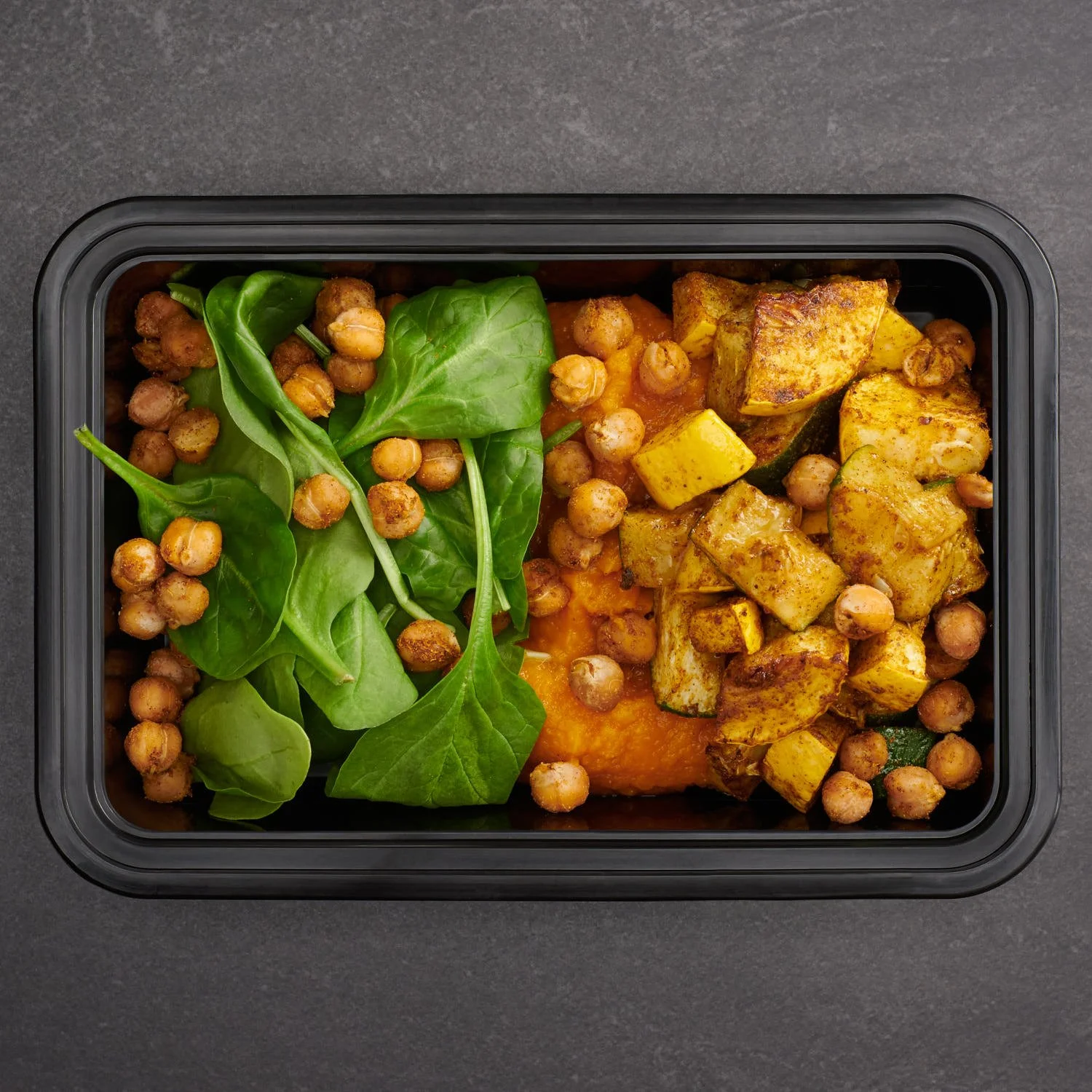
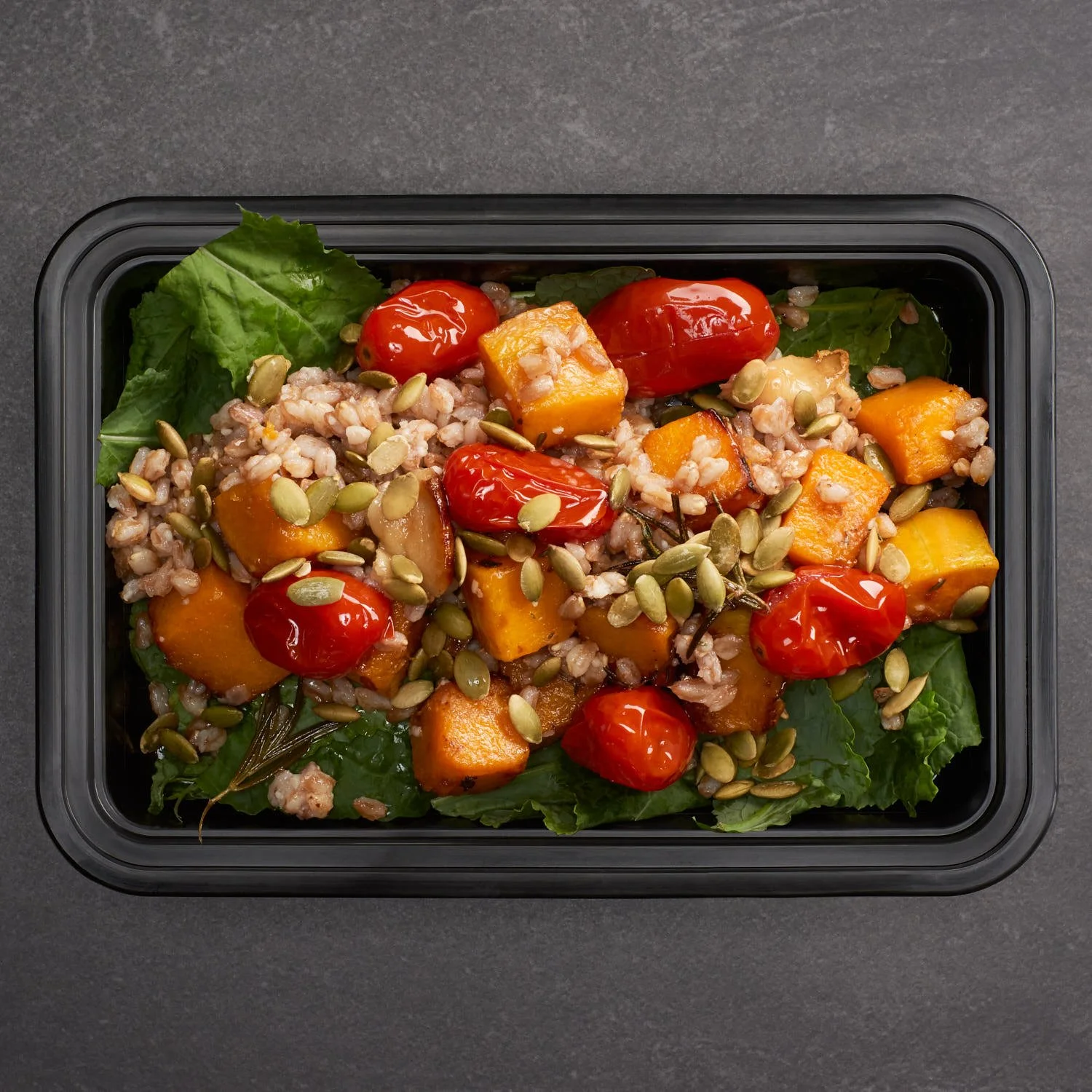
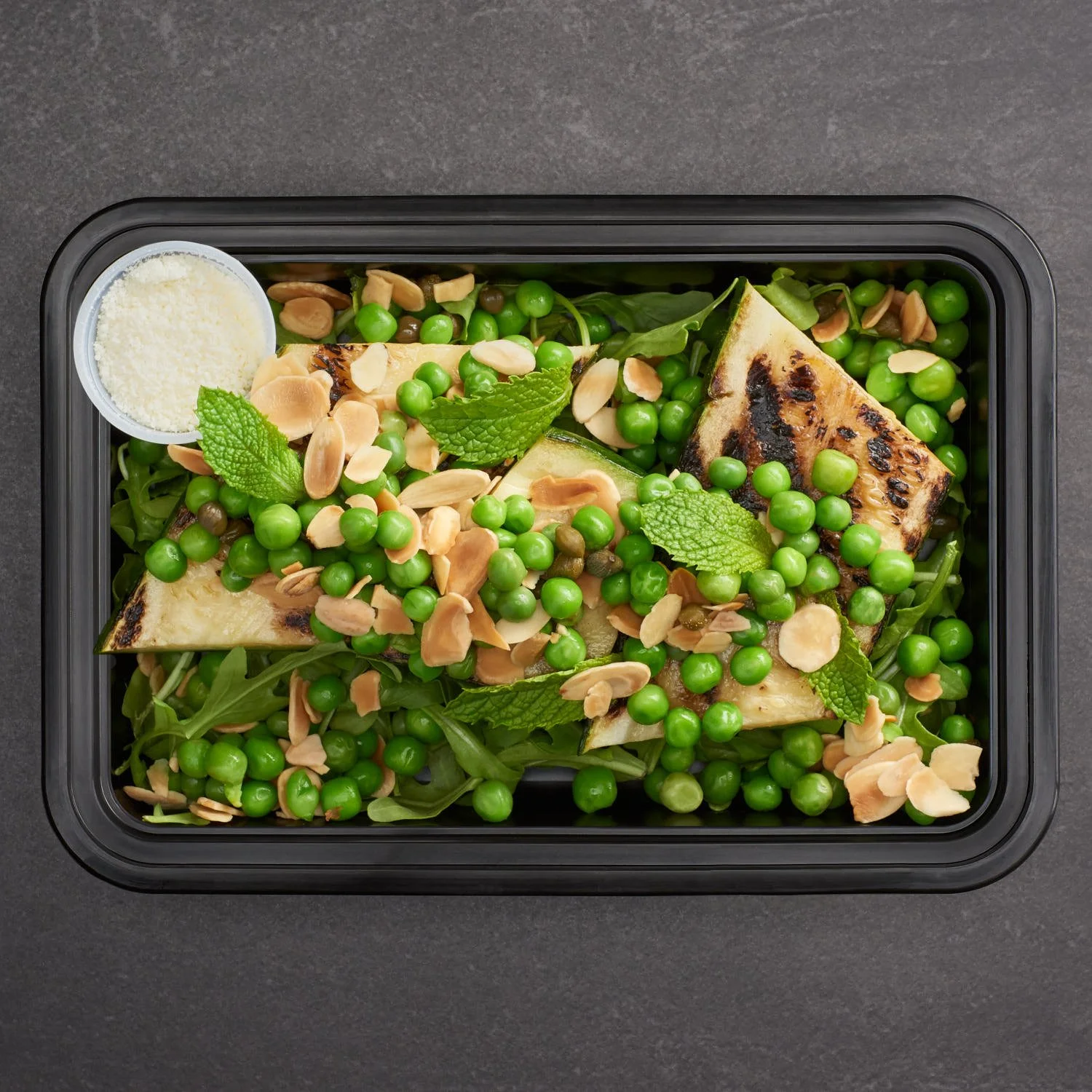
They came to me when they were revamping their website and needed appetizing images to sell their product. When photographing prepared meals for landing and individual selling pages, everything not only needs to look delicious — there needs to be uniformity in lighting, angle, position and color so the page reads as a cohesive, branded whole.
The styling direction came from the owner. Because we'd be shooting the meals in the actual containers they're sold in, she wanted a dark background so the containers would recede and the colorful food would pop. It was a bold choice given the industry-standard bright background, but it really worked. I tested lighting setups and landed on one that brought out the texture of the food with pleasing highlights and shadows. The end result looks more like a painting than straightforward photography — and I love it.
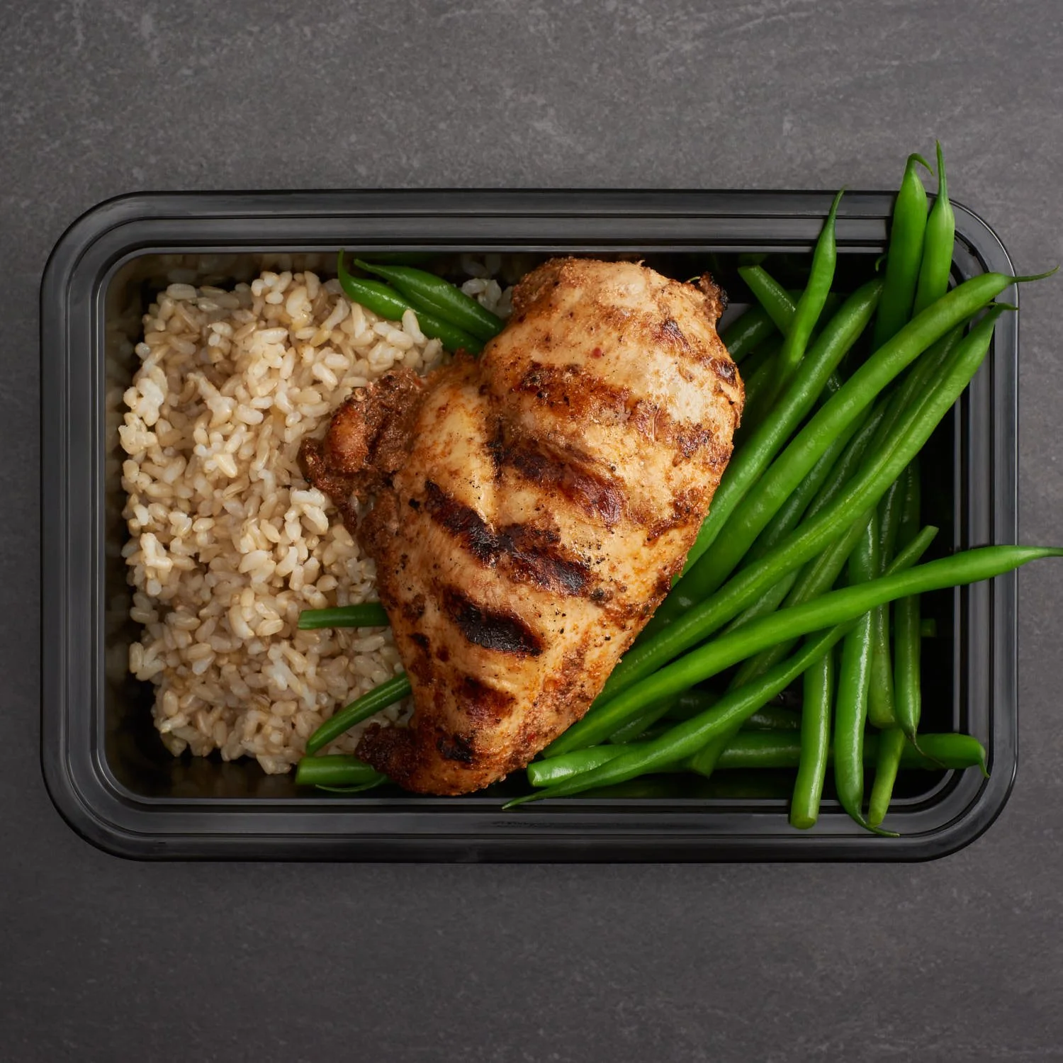
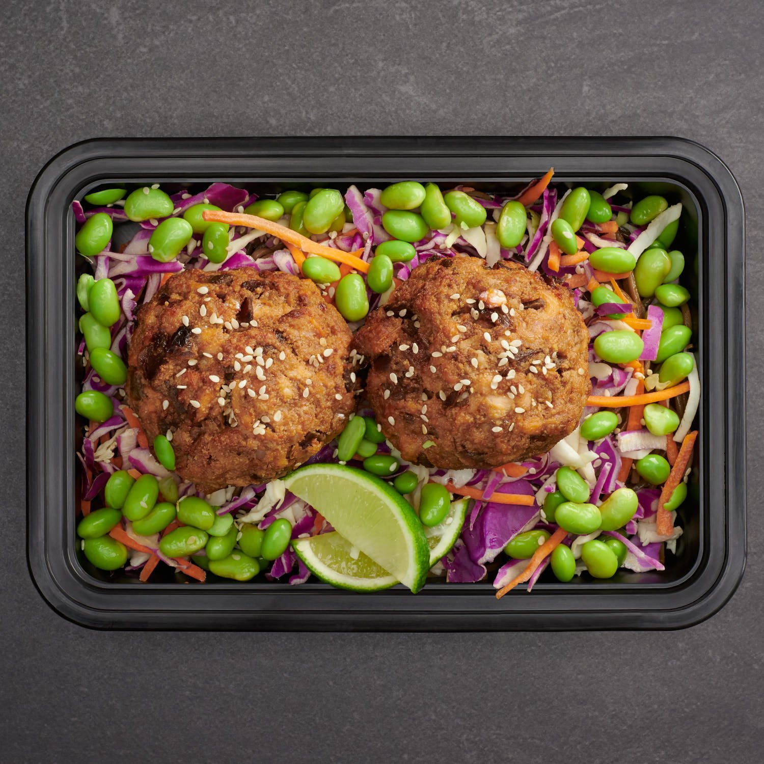

From the first shoot to the last, the look had to remain cohesive, so I took detailed notes of everything. On set, I measured the height, angle and distance of my lights along with settings and modifiers, and photographed the set itself. The only variable that changed was the white bounce card — darker dishes needed more fill, while the brightest might not have needed any at all. Those notes let me recreate the setup each month as we photographed their new dishes.
But uniformity isn't just about aesthetics. I had to work smarter, not harder. With bulk photos, any time saved in post-production makes the business more profitable, so I developed a workflow shortcut: on set, I taped down a representative container so every prepared meal nested in the same spot with no variation in placement. In post, I retouched that empty container and background once, then masked in all of the meals — saving hours I would've otherwise spent cleaning each background and removing reflections from every container.


From a macro perspective, a cohesive body of work signals to potential clients that I can deliver at the quality they need, every time. When a client browses a portfolio, they're not just admiring images — they're imagining handing you a project and trusting the outcome. They want confidence that there won't be a weak shot in the batch, a dud they'll have to work around. A portfolio that holds together visually answers that question before it's even asked. I may have fond memories of older shoots, but they don't demonstrate what I can do now or how much I've grown. So my website is always in a state of flux — newer projects rise to the top, older ones fall off, no matter how instructive they may be.
If you're working on a project that needs that kind of reliable, consistent quality, I'd love to hear about it — let's talk.