Commodity Fragrances
A couple of months ago, the CEO of Commodity Fragrances got in touch with me after seeing my work online and liking the emotion he saw in it. That quality is something they’d been struggling to convey through their photos and he thought I might be able to help. It can be a tough assignment and even a little difficult to explain, but with fragrances especially, anything beyond straightforward product photography needs to be more conceptual and less documentary in nature; it’s about communicating how the fragrance makes you feel, what kind of a mood it generates and maybe even the larger life it promises.
A little background on the company. All of their scents come in three strengths:
Personal (faint enough so only you can smell it, packaged in a clear bottle with white label and cap)
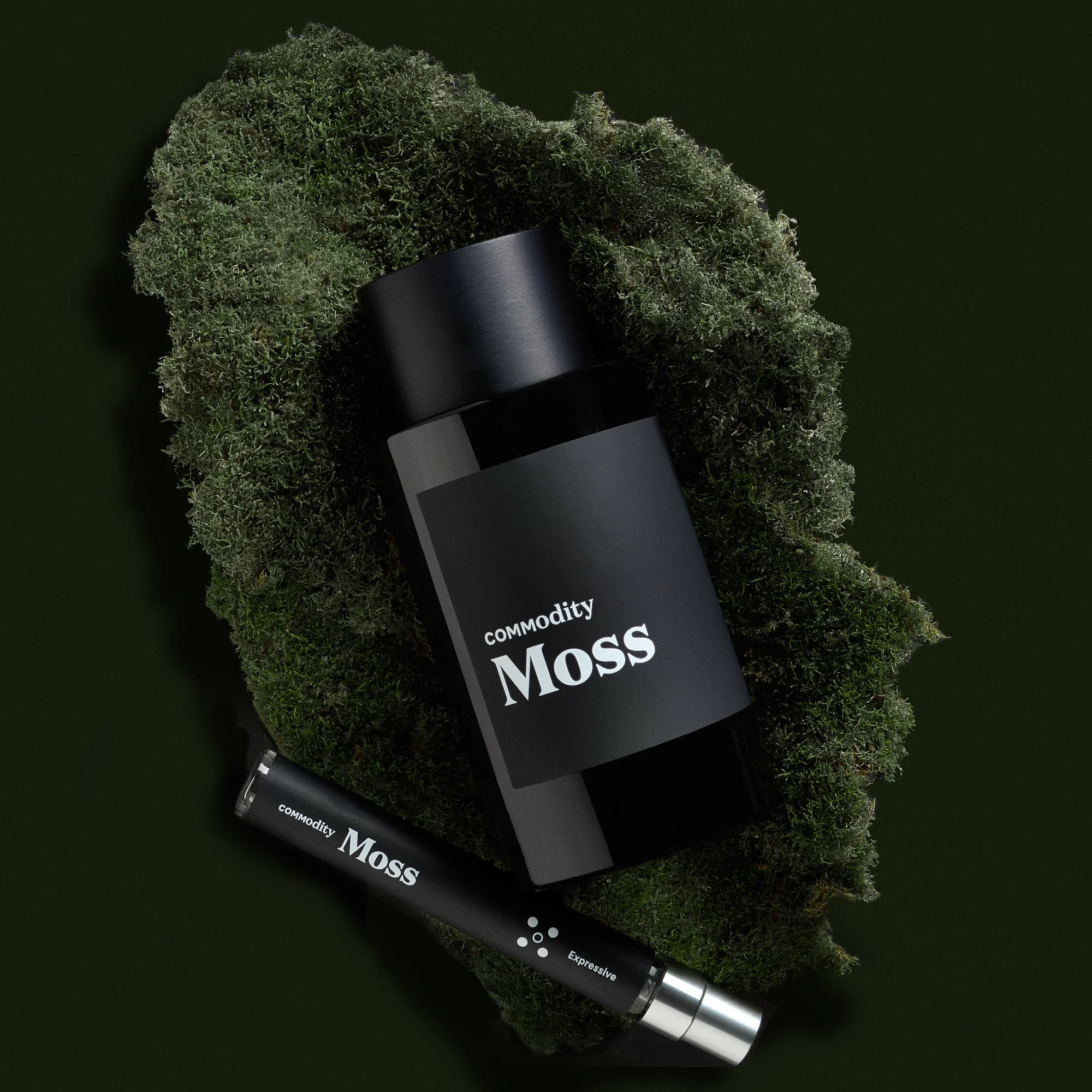
Expressive (for you and anyone you allow in your personal space, packaged in a black bottle with white lettering)
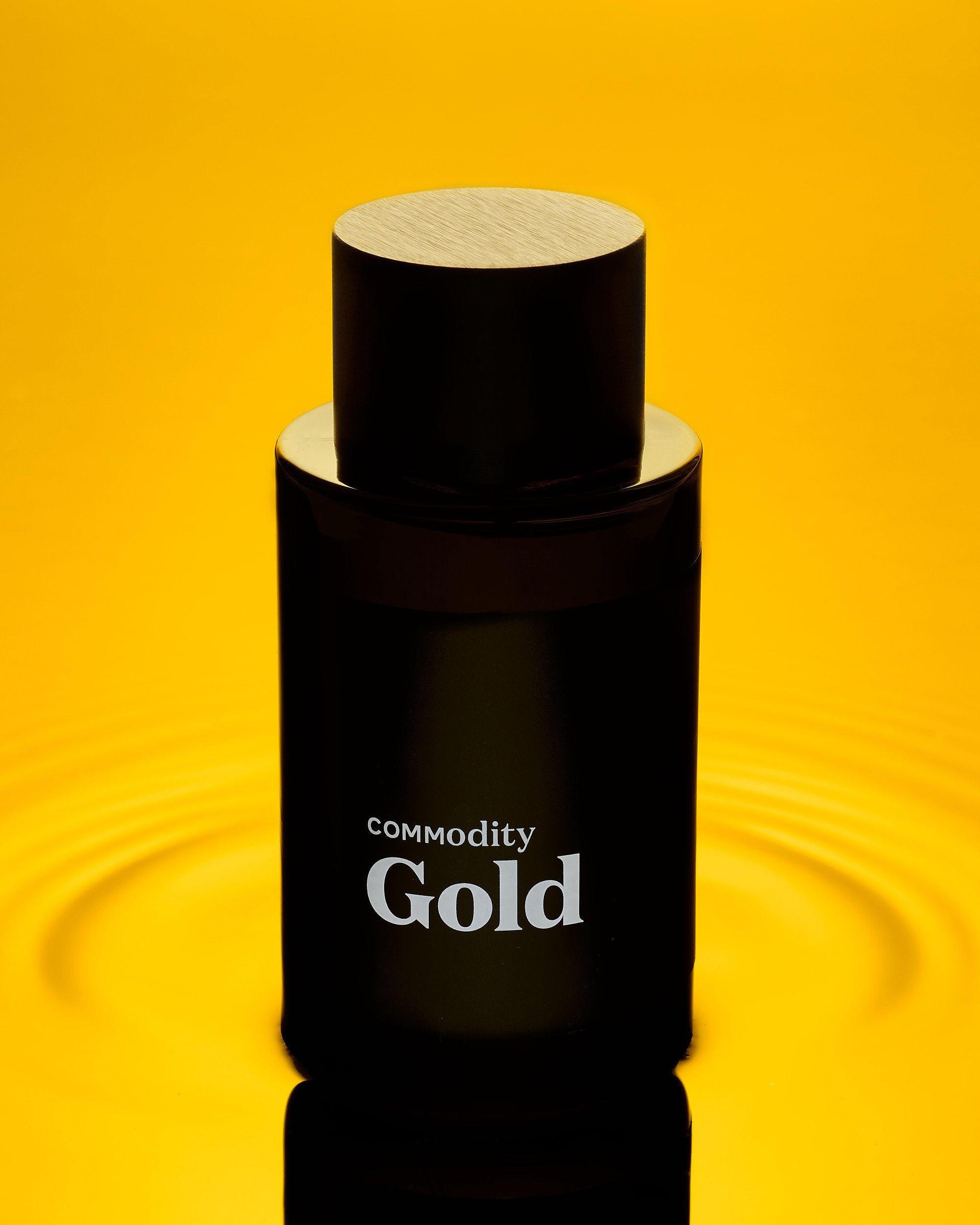
Bold (a big announcement that you’ve entered the room, packaged in a black bottle with metallic bronze-gold lettering)
The challenge was to maintain consistency within each fragrance line, but with enough variety to communicate different depths of emotion for each of the scent strengths. I don’t know about you, but I LOVE taking on this sort of project.
We started with their Gold fragrance line. Their art director turned over an inspiration board and some general guidelines about angles, but left the specifics to me. I felt this fragrance needed a luxe feeling in their photos, something opulent, yet minimalistic enough to live within the company’s brand. I photographed several scenarios, none of which was quiiiite right, then hit upon the idea of immersing the bottles in gold liquid.
The Bold image (top of post) had the deepest, richest colors, which we lightened up for Expressive. Because the Personal scent space uses silver on the packaging, we went with a pool of silver and gentle ripples, with a warm hint of light showing through the bottle to communicate gold.
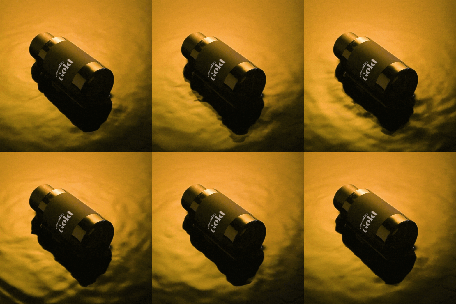
And because I usually try to add motion to my projects — even if only for myself — I created a cinemagraph with endless golden ripples, making a soothing scene.
And those early ideas that didn’t quite work? I like them enough to keep the ideas in my back pocket for future shoots:
I love the quiet stillness of this scene with the bottle going dark in a simple ripple of gold liquid.
The drama of it all! Spotlights and texture! A starburst and rich golden gradients! They create quite a mood.
Silver and gold rays of light bounce and reflect a bottle of Commodity Gold in the personal scent space.
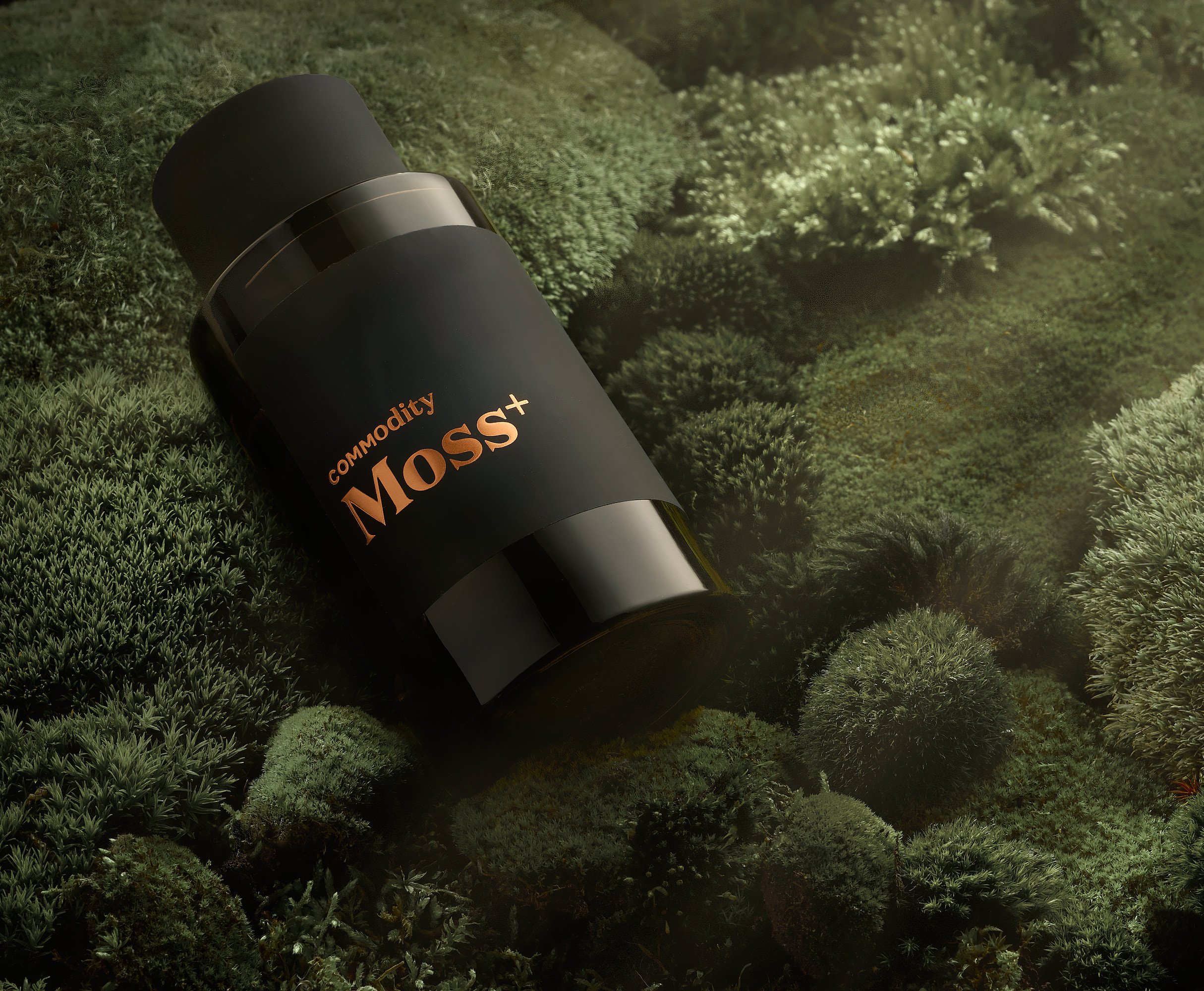
More recently, I photographed their Moss scent. (And I’m telling you, it captures the essence of moss perfectly, minus the mustiness. It’s incredible.)
I explored my moss-covered yard and harvested several different types to add some depth and texture to the scene. The Bold concept (above) showed the bottle nestled in a bed of lush, green moss at daybreak, with the sun peeking through some haze for a dramatic scene, rich with feeling. The Expressive concept was an overhead of the bottle on a moss-covered island on a deep, dark background — a little stark compared to Bold, but still tactile and inviting. And the Personal concept showed the lighter side of Moss, with blurred ferns in a bright background, and fronds caressing the product.
I’m working on Commodity’s Paper fragrances now, and I’m having a ball — can’t wait to share these image with you!
If you’re looking for conceptual product photography, drop me a line. I’d love to chat with you about all the ways we can work together to improve your visuals! I’m adept at art direction in addition to photography, retouching and even propping, so I’m sort of a one-stop shopping for all your product photography needs.


